Making a Book Cover: Part 1
Like many things in life, designing the cover of a book is all about choices. Every color choice, font choice, every space consideration (positive and negative), as well as the choice of elements that appear on the cover concretizes what is actually quite intangible—the author’s written work.
A book is a mysterious object that is both solid (while you are holding it in your hands) and ephemeral because the content exists in our minds, in our imaginations, or really, in the space between our mind and the page.
My process goes something like this:
Begin:
Read
Discuss
Generalize (throw a lot of ideas on the table)
Focus (pick a direction, or 2)
Sketch (pencil to paper before mouse to screen)
Design
Iterate (look at the design ideas and keep adding to the options)
And then:
Discuss
Re-design
Present options to the author
Discuss
Re-design
Choose the one that feels the closest
Decide we’ve made a cover
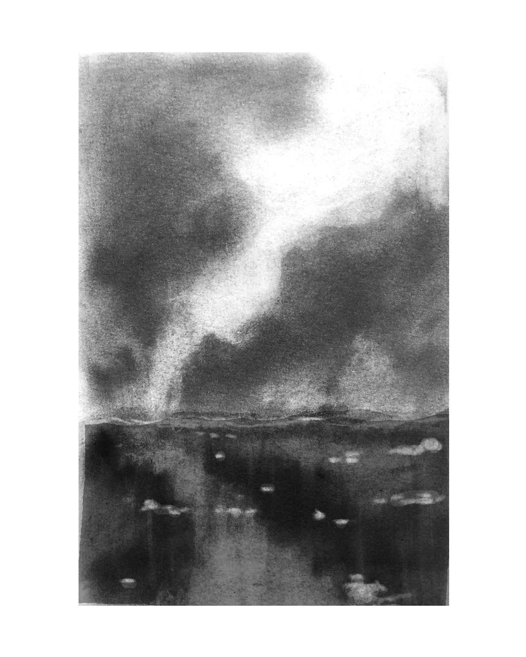
When it was time to design Laura Bonazzoli’s book Consecration Pond, I added a new element: inviting an illustrator to create an image for the cover. Enter, Elizabeth Ogle, a professional freelance illustrator who specializes in narrative illustration.
My early conversations with Elizabeth were about the feel of the stories, the themes and the overall vibe of the book—this is a book about the nature of wisdom, the risks and gifts of allowing ourselves to be seen, forgiveness, redemption and the challenge of how to create meaning in the wake of loss.
I looked at the architecture of the book:
a collection of linked short stories that stand alone and also form a cohesive story “cycle” when read together;
some of the characters move in and out of the stories and the reader meets them several times;
all the stories take place around the one central character—Consecration Pond.
We talked about the landscape of these stories:
how they’re set around a pond in Maine;
how there’s a long view and the stories create a map forward;
how there’s also a sharp focus—the pond, and so we had to consider the seasons;
how to represent nature, and light and dark;
how to illustrate the idea of forgiveness and what the illustration would need to “feel” like to convey that idea.
Elizabeth sent us early sketches (some are pictured above).
Which turned into more-polished sketches… which became the final sketch…
Next blog post: Making a Book Cover: Part 2.


