
Orange is More than a Fruit

When we use color in design or when creating a brand identity, we use it to send a message—to tell our audience something about the product or ourselves, to give our followers a cue as to what’s important to us, and what we believe in, and to create a feeling, an emotion.
Are you thinking: Really? By picking a few colors and putting them together, we’re saying all that? Yup, we actually are, or I’ll rephrase, we actually can. Color can work at a subconscious level to create feelings, form opinions, it can change minds, it can stir up a reaction—positive or negative.
So, Orange. It's noisy, it’s exuberant, it’s expansive, vibrant, spontaneous and sometimes frivolous. Orange brings warmth and sensuality, and it can also feel unpretentious and youthful, childlike even.
Orange is a Secondary color—made by mixing the two primary colors—red and yellow—and it’s compliment {or opposite} on the color wheel is blue. Pairing Orange and Blue together creates a scenario where one color will stand out from the other. Want your audience to be drawn to a button or certain part of your website? Try creating an Orange background with a button done up in blue. The viewers eye will go right to the blue button.


One of my own favorite color combos is pairing Orange with Purple or an Orchid-y Pink. In color theory language the relationship between Orange and Violet {or Purple} is called a “split complimentary” so it still possesses some of the same opposition pull of Blue and Orange, but it’s softer, less “loud”.
So, if you’re considering using Orange in your branding colors, or in a design project, here are a few things to ponder:
Do you want to get someone's attention quickly, and still have the piece feel friendly and approachable? Orange can do that for you.
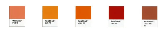
Orange has a few different personalities: A brilliant orange is vital and vibrant, whereas a lighter shade—peach or apricot—is welcoming and deliciously warm.
If you use Orange as an accent color to direct people to action—for instance on a button or a sign-up form—try using it with its complementary color Blue, and play with how loud you want your message to be.
Terra Cotta-y Oranges are earthier and less “loud”. Think of the weathered colors of a Mediterranean villa or the natural colors of the South West.

How could orange support your business or brand?
How would you like Orange to speak for you? What would it say about you or your business or project?
How could you use it to create an expansive and persuasive look for your project?